Power BI April Feature Summary
Over the past two months, Microsoft 365 has made leaps and strides in improving usability, flexibility, and security within all it’s apps. As the workforce continues to adjust to new hybrid working expectations and BYOD culture, Microsoft has progressed in parallel. From easier account switching to new updates for Microsoft Teams and 365 users, 2022 is the Microsoft’s year for enhancing user experiences.
As a leading Power BI consultancy, we’ve had the opportunity to put those changes to the test, with large enterprise clients and pro-bono projects for businesses across the globe.
Using Power BI to support NRC
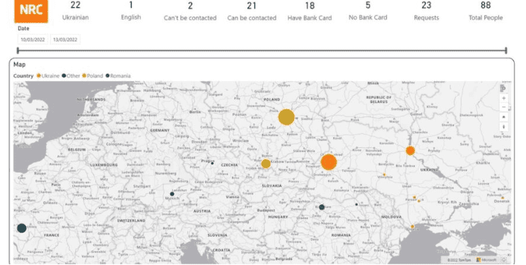
To prove the never-ending capabilities of Power BI, we recently partnered with Twig and the NRC to create a Power BI dashboard to support the Ukrainian refugee rescue efforts. Our lead technician on the project, Victoria Hadlow, talks candidly about her personal involvement on the project in our recent blog post.
Error bar charts

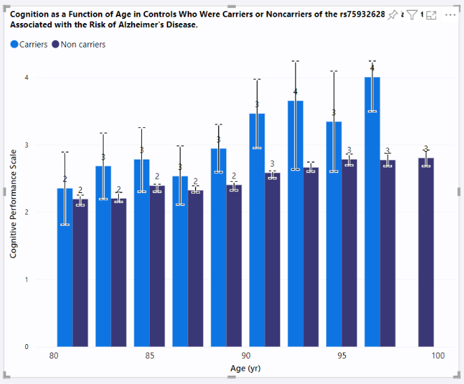
The error bar addition to line charts was a major milestone for displaying data uncertainty in native Power BI reports. Great to see Microsoft rolling this out on clustered column and bar charts now. Error bars are enabled specifically for clustered charts and not stacked, where such a visualisation would be unclear about the categories being represented.
This reflects a noticeable improvement in the statistical analysis potential within Power BI reports.
Bookmark navigator

End users are now provided with clear buttons for manoeuvring between filters. New changes also allow end users to navigate multiple bookmark groups on the same page. Power BI interprets that the two bookmarks are filtering on different dimensions and leaves both selected for visual clarity and ease of use.
Power BI Outlook
At the end of March, the Power BI team at Microsoft opened up Power BI in Outlook to their Targeted Release and Office Insiders beta testing program – continuing their mission to empower every individual, team, and organisation to seamlessly connect data into their work.
Modern visual tooltips

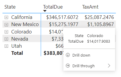
Tooltips now support drill actions for matrix, line, and area charts.
Drilling down in tooltips is an intuitive way to view more data in less time. However, this wasn’t available previously in matrix, line or area charts. The addition of these charts helps get this useful feature into the hands of even more of our clients.
Our take on the changes
The April changes introduce significant improvements for report navigation and dynamic queries. With these new features now available, it will be exciting to see the enhanced UX in action and explore the potential for completely new report designs. The updates to Goals will hopefully improve the user experience and help make Goals a more viable tool for our clients.
As Microsoft responds to the feedback surrounding the new formatting pane, it will be interesting to see what other visual changes will be made to the Power BI layout.
“With latest updates to Power BI it is clear that Microsoft have listened to their user base and introduced some much needed features specifically around navigation and dynamic queries that will move the platform to the next level and make the user experience a more logical and friendly one. More importantly for our clients it will keep Power BI as the go to solution for all their Analytics requirements.”
—Victoria Hadlow, Power BI division


