
Mastering Power BI: Tips for Improved Data Visuals
As experts in software solutions, we understand the pivotal role data plays in decision-making and strategic planning. Microsoft Power BI, a premier business analytics service, offers powerful tools to transform data into actionable insights. This article dives into the essentials of using Power BI, guiding you through its fundamental components, standout features, and practical applications in business intelligence.
Our journey begins with a thorough exploration of Power BI’s capabilities. From small startups to giant corporations, organisations utilise Power BI to harness their data effectively. The platform not only simplifies data analysis but also enhances the visual representation of complex information, making it accessible to decision-makers at all levels. Here, we’ll unpack these features, providing you with a solid foundation to begin creating your own data visualisations.

Next, we provide a practical guide to designing your first Power BI dashboard. This step-by-step approach ensures that even those new to Power BI can confidently utilise the tool to its full potential. By focusing on the creation process, we aim to empower you with the skills to customise Power BI, meeting specific business needs and driving more informed decisions across your organisation.
Understanding the Basics of Microsoft Power BI
In our ever-evolving digital landscape, ensuring that our clients have the tools to harness the power of data is crucial. That’s why we focus on empowering businesses with Microsoft Power BI. This transformative business analytics service provides comprehensive tools to transform your data into actionable insights. The platform enables anyone to visualise and analyse data with greater speed, efficiency, and understanding. It interfaces seamlessly with existing applications, which ensures that we can provide streamlined solutions tailored to specific business needs.

At its core, Power BI connects to a vast array of data sources, from basic Excel sheets to databases, and cloud-based data services. The integration capabilities mean that it’s not just about viewing static reports. Instead, we help you interact with your data, ask questions, and make informed decisions. This ability to integrate and analyse data across platforms without extensive technical know-how makes Power BI an invaluable tool for businesses aiming to thrive in a data-driven environment.
Key Features of Power BI for Effective Data Visualization
When it comes to data visualization, Power BI packs a powerful punch. Here are some key features that we leverage to help you visualise your data effectively:
- Real-Time Dashboards: One of the standout features of Power BI is its real-time dashboard updates. Data can be streamed in real time, which means that the dashboards display up-to-the-minute data. This is crucial for making timely decisions in a fast-paced business environment.
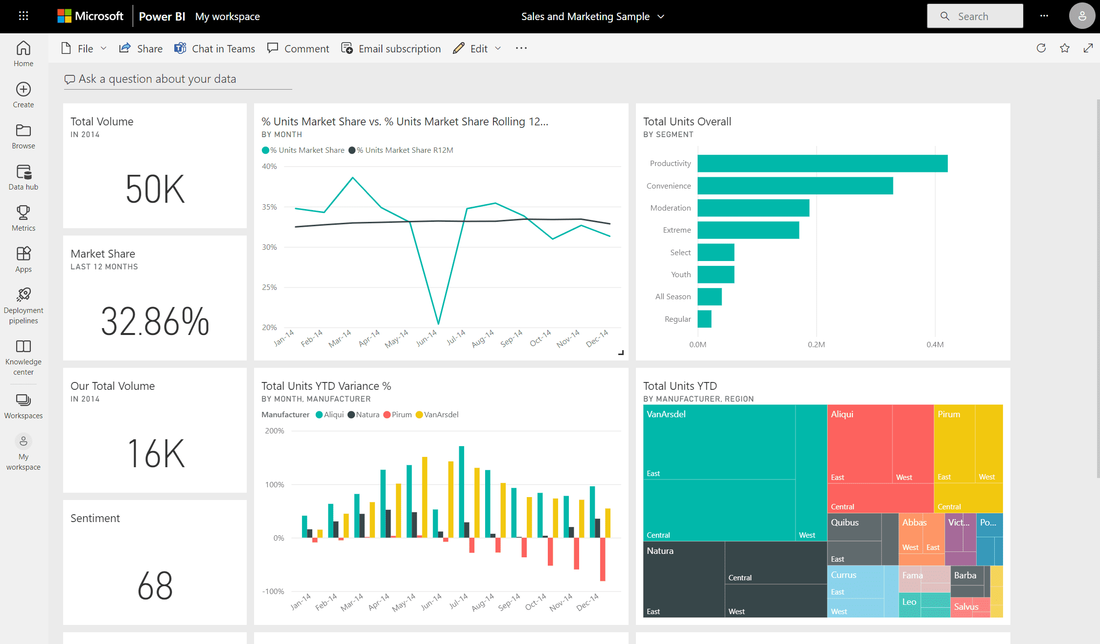
- Rich Custom Visuals: The platform not only allows you to use standard visualisations like bar charts and line graphs but also supports custom visuals. This feature enables us to tailor visualisation tools to better fit your unique business requirements and data types.

- Natural Language Query: Power BI’s Q&A feature lets you explore your data using intuitive natural language. This means you can ask questions like “What were the sales last year?” and get answers in the form of interactive charts or graphs.
- Data Security: We understand the importance of data security. Power BI provides robust security features at the dataset level, which includes row-level security and dynamic data masking to protect sensitive information.

Through these features, we maximise the utility of Power BI, transforming complex data into actionable, easy-to-understand visual representations. This helps drive smarter business strategies and achieve better outcomes, making your data work for you in the most efficient way possible.
Best Practices to Enhance Your Power BI Visuals
To truly leverage the powerful capabilities of Power BI, we adhere to several best practices in designing our visuals. Clear and effective visualisation is key to making data understandable and actionable. One major practice we follow is consistency in design, which aids users in quickly interpreting the visuals without confusion. We maintain uniform fonts, colours, and styles across all visuals, which not only enhances aesthetics but also supports cognitive processing.
Moreover, we apply the principle of strategic use of colours. Colours are a powerful tool in guiding attention and should be used sparingly to highlight significant data points or trends. Another practice is the optimisation of the layout. We organise the visuals in a dashboard according to their importance and relevance, ensuring the most critical data are most prominent. This hierarchical placement supports a logical flow of information, making the dashboard both effective and user-friendly.
Wrapping Up the Power of Visualisation with Power BI
Harnessing the power of Microsoft Power BI allows us to transform raw data into meaningful insights effectively. The capability of Power BI to integrate various data sources and its intuitive design tools enables us to deliver comprehensive analytics solutions tailored to specific business needs. Whether it’s through detailed trend analysis, performance metrics, or forecast projections, Power BI equips us with the necessary tools to make informed decisions that drive business success.
Our expertise in transforming complex data into actionable insights can help your business thrive in a data-driven environment. With continuous advancements and updates in Power BI, we stay at the forefront of business intelligence, ensuring that our solutions are not only relevant but also innovative. If you’re looking to unlock the potential of your business data through tailored Microsoft solutions, get in touch with us at Influential Software today. Let us help you make the most of your data.